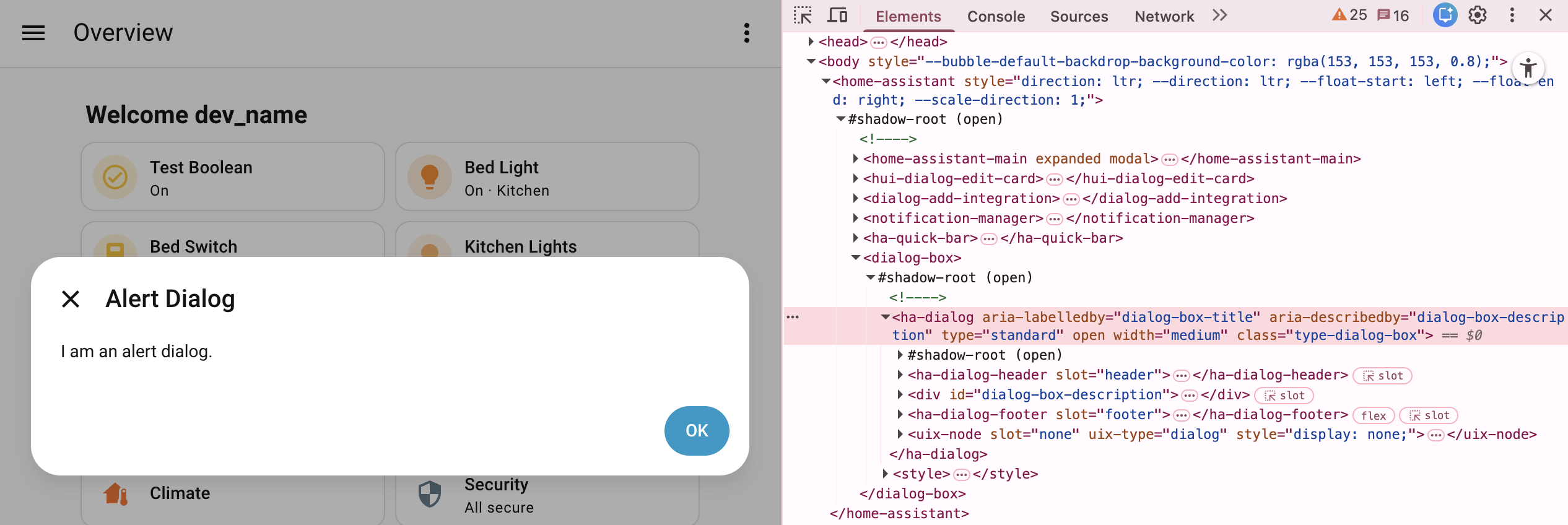
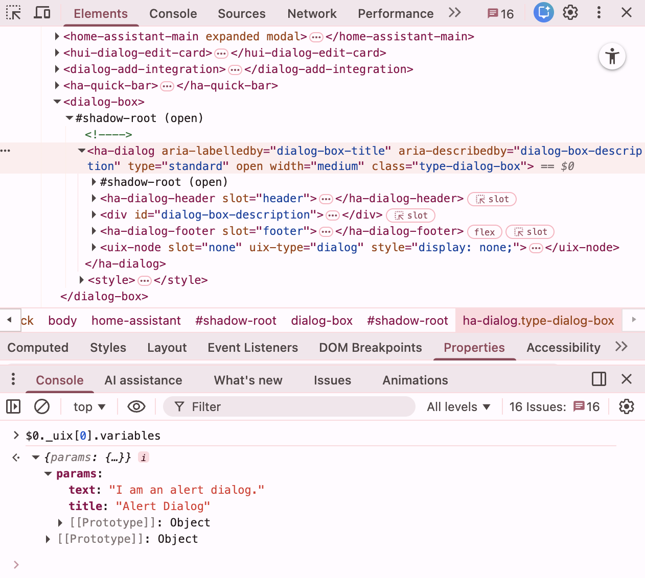
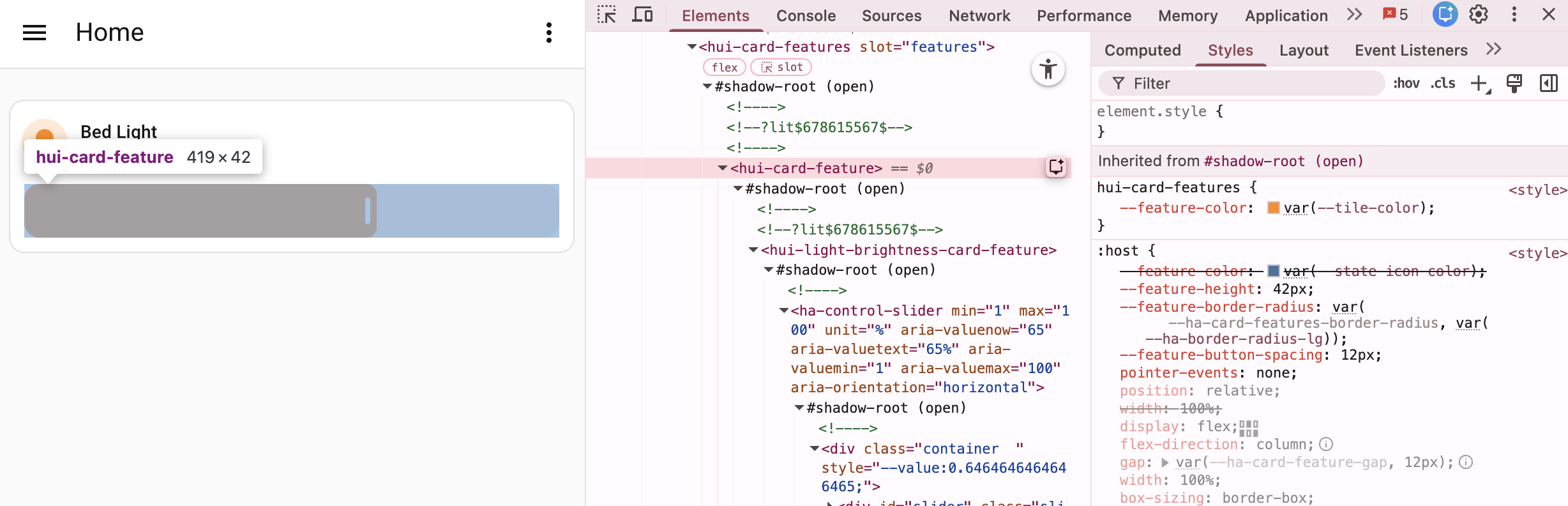
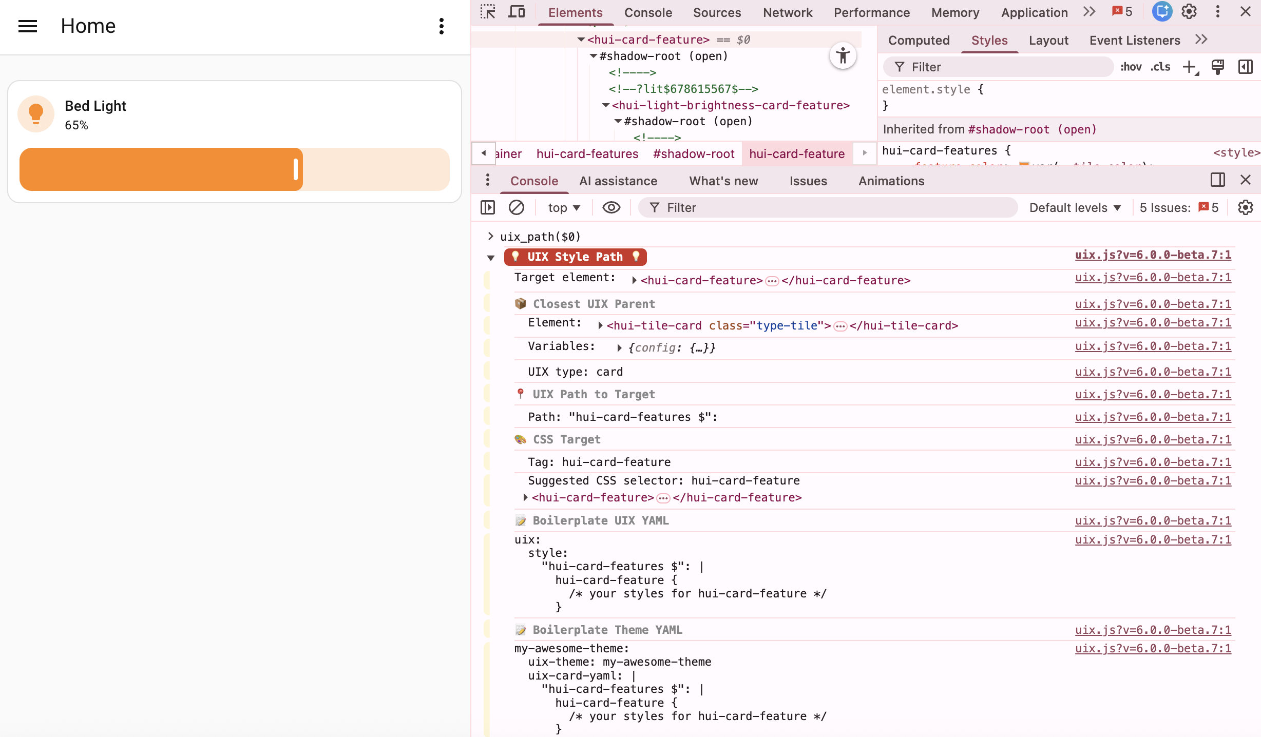
Host/element path selector
Applying this guide requires the & Host/element path selector
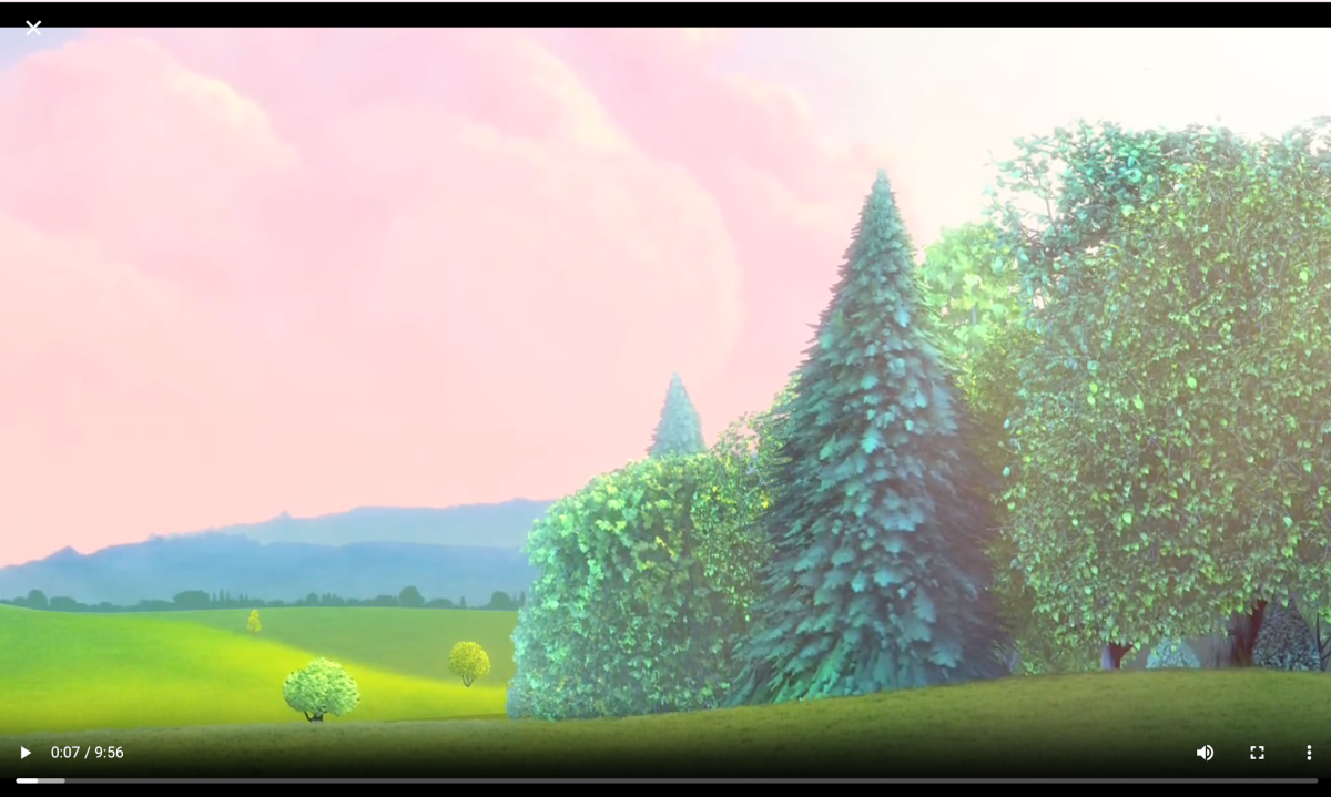
When viewing media in the Home Assistant Media panel, the dialog used is large in size. This guide shows how to make the dialog fullscreen, without title so you can focus on the media itself. Videos will fit by default and img styling is included to make sure they are contained.
Styling dialogs is done using a theme. Check out styling dialogs
Style dialog size
First the dialog needs to be set to full width and height. As the web browser media player uses dialog size large --ha-dialog-width-lg, the size used when dialogs have size set to large, is overridden. Also set is --ha-dialog-width-full which is the size used when the dialog is shown on a small device screen. Safe areas are not considered here as it is likely you would wish the dialog to cover all of a device’s screen.
The web browser play media dialog will have a class of .type-hui-dialog-web-browser-play-media. This is used with a CSS selector to target the dialog only when it has class of .type-hui-dialog-web-browser-play-media.
Yaml style selectors are used as they will be needed in the following steps.
  uix-dialog-yaml: |
    .: |
      ha-dialog.type-hui-dialog-web-browser-play-media {
        --ha-dialog-width-lg: 100vw;
        --ha-dialog-width-full: 100vw;
        --ha-dialog-min-height: 100vh;
        --ha-dialog-border-radius: 0;
        --dialog-content-padding: 0;
      }
Style dialog header and content - full example
Since the styling is being applied in a theme for uix-dialog-yaml it will apply to all dialogs. So yaml selectors need to filter to the web browser dialog only using & Host/element selector.
The web browser play media dialog will have a class of .type-hui-dialog-web-browser-play-media A parent key selector of "&.type-hui-dialog-web-browser-play-media" is used to target the dialog only when it has class type .type-hui-dialog-web-browser-play-media.
Specific customizations:
- The element itself
.:imgset toobject-fit: contain;so when the media is an image it is not distorted.
"$ ha-dialog-header $"targeting the dialog header shadow rootsection.header-contentdisplay set to none to not show the title.header.header, the header bar, set toposition: absolutewithz-index: 1so it shows at the top overlaid on the media image/video andcolor: whiteso the closeXis most visible. Safe areas may be considered here ontopposition if required.
"$", the shadow root of the dialog.- Background is set to black
- Display is set to flex to have image/media vertically aligned centrally.
  uix-dialog-yaml: |
    .: |
      ha-dialog.type-hui-dialog-web-browser-play-media {
        --ha-dialog-width-lg: 100vw;
        --ha-dialog-width-full: 100vw;
        --ha-dialog-min-height: 100vh;
        --ha-dialog-border-radius: 0;
        --dialog-content-padding: 0;
      }
    "&.type-hui-dialog-web-browser-play-media":
      .: |
        img {
          object-fit: contain;
        }
      "$ ha-dialog-header $": |
        section.header-content {
          display: none;
        }
        header.header {
          position: absolute;
          z-index: 1;
          color: white;
        }
      "$": |
        wa-dialog div.content-wrapper div.body {
          display: flex;
          background: black;
        }
Media player web browser styled fullscreen
