UI eXtension Guides
Styling adaptive popover dialogs - date picker example
Home Assistant Frontend 2026.5 brought in a new adaptive popover dialog. It is like standard dialogs but on desktop shows a smaller dialog in place targeted to the element using the dialog, and on mobile uses a bottom sheet. The date picker dialog now uses adaptive popover dialog.
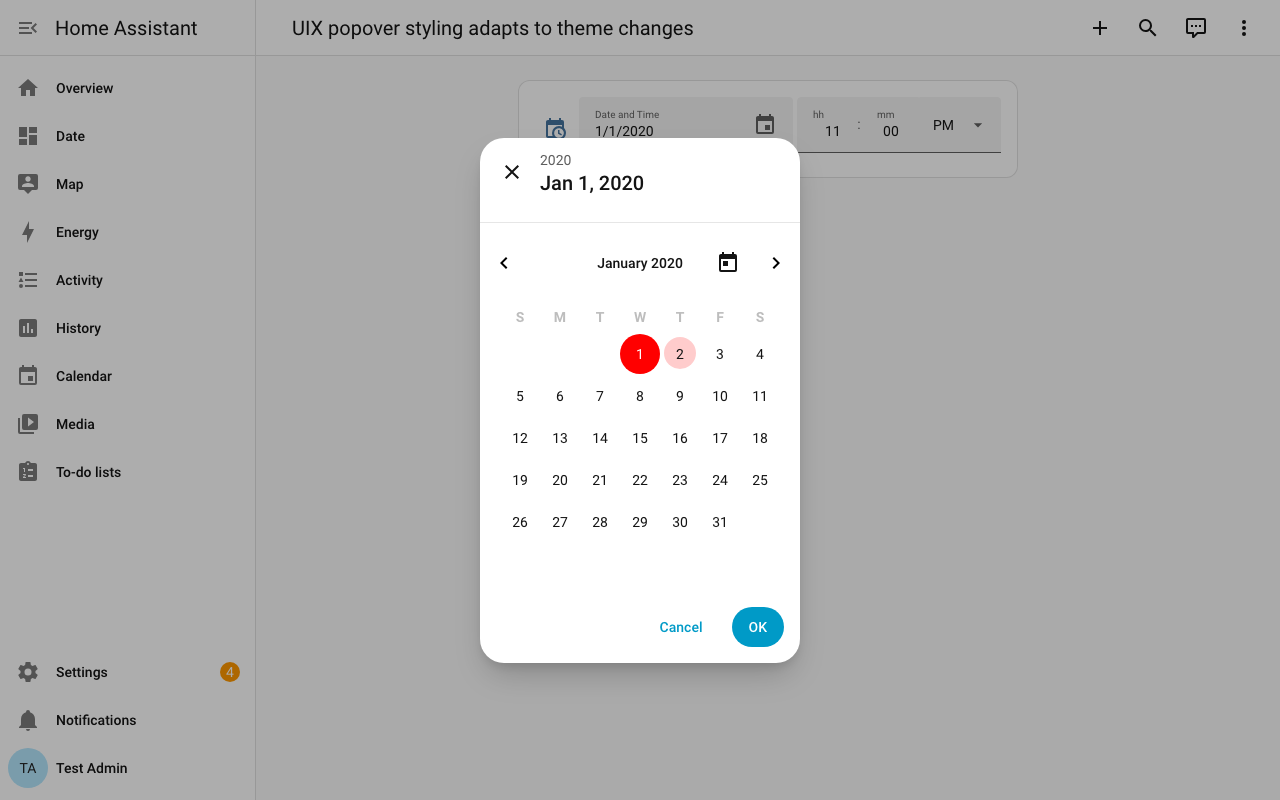
UI eXtension can style the adaptive popover using uix-dialog-yaml theming.
The example below shows an entities row with a date entity which will show the adaptive popover. The theme styling sets selected date(s) to red, and hover to red with opacity of 0.2. The theme yaml selector uses UIX Styling Host/element path selection to only target dialogs of type-dialog-date-picker.
CSS selectors
The CSS selector for hover, calendar-month:not(.dummy)::part(button selected):hover, includes a class .dummy that never exists. This is so this CSS selector always matches at a higher specificity (0,2,2) than the hover CSS, calendar-month::part(button):hover (0,1,2), that sets the background with opacity 0.2, which is already using !important to override the standard CSS. This technique can be used when you need to make sure that a CSS selector will get higher specificity as the :not(.dummy) class selector will always add +1 for class specificity.
uix-date-picker-selection: # theme name
  uix-theme: uix-date-picker-selection # setting UIX theme to theme name

  uix-dialog-yaml: |
    "&.type-dialog-date-picker": |
      calendar-month::part(range-inner),
      calendar-month::part(range-start),
      calendar-month::part(range-end),
      calendar-month::part(selected),
      calendar-month::part(selected):hover,
      calendar-month:not(.dummy)::part(button selected):hover {
        background-color: red !important;
      }
      calendar-month::part(button):hover {
        background-color: rgba(255, 0, 0, 0.2) !important;
      }
Styling date picker adaptive popover dialog