UI eXtension Guides
Using UIX Forge more-info spark combined with UIX actions
Elements used:
- UIX Forge more-info spark
- more-info UIX action
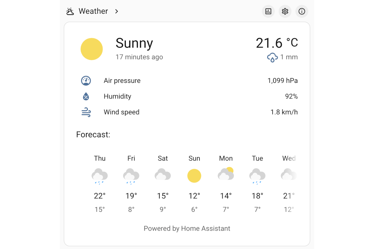
A vertical-stack is used with a heading card containing badges that use UIX actions to show specific more-info pages - history, settings and related.
The example YAML is for a grid section in a Sections dashboard.
type: grid
cards:
  - type: vertical-stack
    cards:
      - type: heading
        icon: mdi:weather-partly-cloudy
        heading: Weather
        badges:
          - type: button
            icon: mdi:chart-box-outline
            tap_action:
              action: fire-dom-event
              uix:
                action: more-info
                data:
                  entity: weather.demo_weather_south
                  view: history
          - type: button
            icon: mdi:cog-outline
            tap_action:
              action: fire-dom-event
              uix:
                action: more-info
                data:
                  entity: weather.demo_weather_south
                  view: settings
          - type: button
            icon: mdi:information-outline
            tap_action:
              action: fire-dom-event
              uix:
                action: more-info
                data:
                  entity: weather.demo_weather_south
                  view: related
        tap_action:
          action: more-info
          entity: weather.demo_weather_south
        heading_style: title
      - type: custom:uix-forge
        forge:
          mold: card
          sparks:
            - type: more-info
              entity: weather.demo_weather_south
More-info spark in vertical stack with heading card and more-info action badges