 UI eXtension Guides
Styling dialogs with UI eXtension
Home Assistant uses a dialog manager through which most dialogs are shown. UIX patches through the showDialog() method to allow styling dialogs via UIX theme.
As there are many different types of dialogs, UIX guides will not be able to cover all dialogs so this guide will lead you through inspecting the DOM to discover more about the dialog you wish to style, and leading you through when to use a template to target the dialog specifically.
DOM example
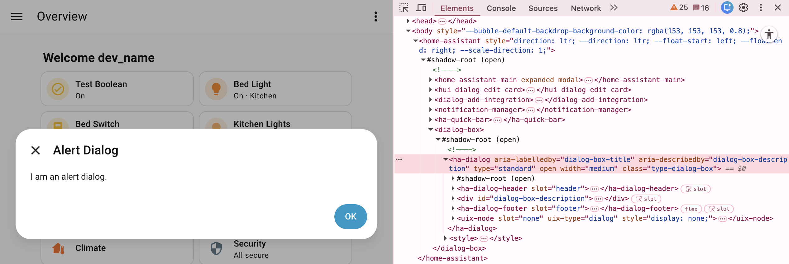
Above you will see an example of an alert dialog from Home Assistant 2026.3+. Dialogs managed by Home Assistant’s dialog manager will always be the last child element of the shadowRoot of <home-assistant>. The outer element will be the dialog parent element, which for the alert dialog example is the generic Home Assistant <dialog-box>. Generally dialogs will use a shadowRoot under which there will be the dialog element, usually either <ha-dialog> or <ha-adaptive-dialog>. It is this level which UIX is patched and applied for dialogs.
Basic styling can be done to the dialog element, in the alert example this is ha-dialog. As the dialog patch is universal, you are best to use the UIX type class to scope your styling, which is type-dialog-box in the alert example.
Basic example
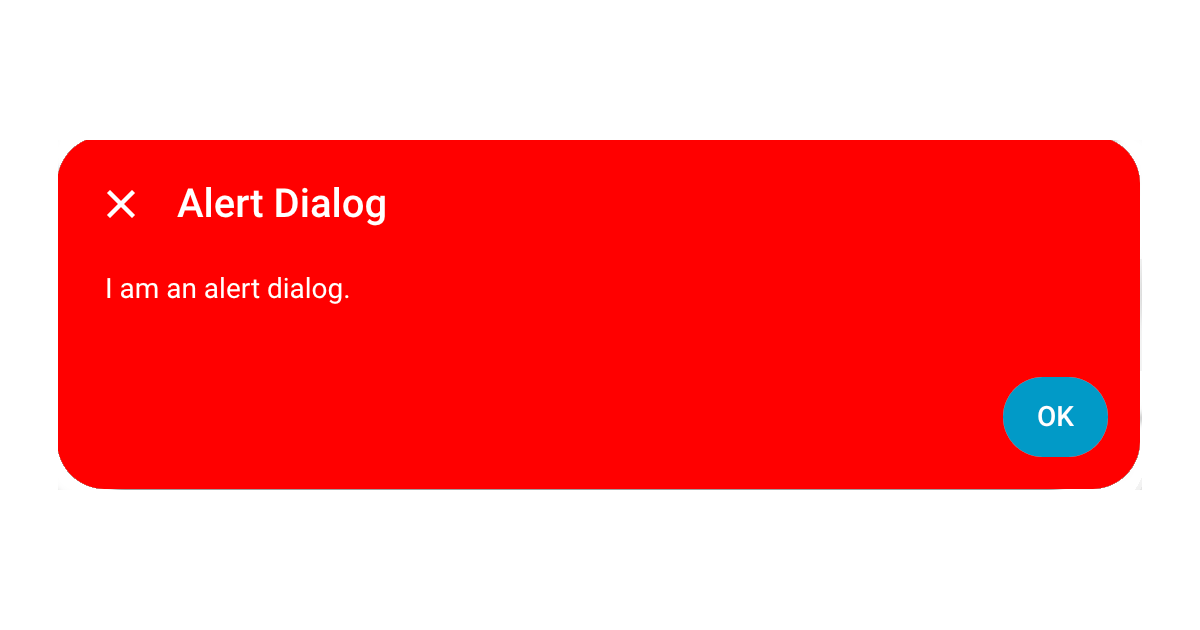
Below is theme yaml code to make the dialog background red and the text white. Yaml selectors are used as you will generally need to go to the dialog element shadowRoot when styling dialogs.
UIX Theme:
  uix-theme: UIX Theme
  uix-dialog-yaml: |
    .: |
      ha-dialog.type-dialog-box {
        --card-background-color: red;
        --primary-text-color: white;
      }
Styled dialog
Template example
The basic example for an alert dialog will style all dialogs of UIX class type-dialog-box. This is the generic Home Assistant dialog and covers many dialogs including alerts and confirmation dialogs. If you wish to scope your styling to a specific dialog, you will need to template your styling, taking advantage of params variable which will be available in the template.
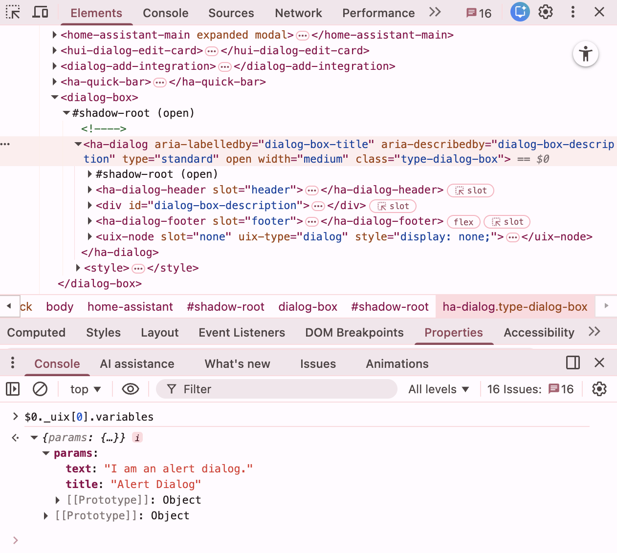
Your can view the params available for the dialog using your browser’s element inspector and console. With the dialog element, in the alert example ha-dialog selected, type the following code to see the UIX variables, which includes params.
$0._uix[0].variables
Dialog params
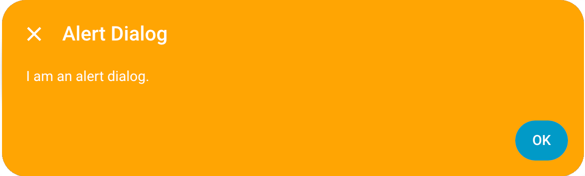
Knowing params which are available you can make a template to target this alert dialog by title.
Dialog text
An important tip to note is that dialog text is after localization. Localization keys are not available as the localization is done before the dialog is called.
UIX Theme:
  uix-theme: UIX Theme
  uix-dialog-yaml: |
    .: |
      ha-dialog.type-dialog-box {
        --card-background-color: red;
        --primary-text-color: white;
      }
      {% set titleText = params.title if 'title' in params else '' %}
      {% if titleText == 'Alert Dialog' %}
      ha-dialog.type-dialog-box {
        --card-background-color: orange !important;
      }
      {% endif %}
Styled dialog
Vertical centering
ha-dialog uses wa-dialog which in turn uses the browser’s <dialog> element. The only way the <dialog> element can be adjusted vertically is to use --dialog-surface-margin-top. By default this is set to auto. If you wish to have the dialog 40px from the top, like more-info dialog, you can set --dialog-surface-margin-top: 40px.
UIX Theme:
  uix-theme: UIX Theme
  uix-dialog-yaml: |
    .: |
      ha-dialog.type-dialog-box {
        --dialog-surface-margin-top: 40px;
      }
Using shadow DOM
Most dialog styling can be done using CSS vars that pierce shadowRoot. However some stylings need to carries out on wa-dialog which is in shadowRoot. Below are examples to get you started.
Move to bottom
To move a dialog to bottom you need to set top: unset, bottom: 0 of the actual dialog element used by wa-dialog.
UIX Theme:
  uix-theme: UIX Theme
  uix-dialog-yaml: |
    $ wa-dialog $: |
      dialog {
        margin-top: 0 !important;
        top: unset !important;
        bottom: 0 !important;
        margin-bottom: 20px !important;
      }
Slide-in or other animations
Animations can be slightly problematic for wa-dialog as it has its own animation for show/hide (and pulse if dismiss is blocked). Setting animation times to 0 mostly solves this but you may see the popup briefly before animation.
The following is generally working well.
UIX Theme:
  uix-theme: UIX Theme
  uix-dialog-yaml: |
    .: |
      ha-dialog {
        --dialog-surface-margin-top: auto !important; /* vertically centered */
        --ha-dialog-show-duration: 0;
        --ha-dialog-hide-duration: 0;
      }
    $ wa-dialog $: |
      @keyframes slide-in { from { transform:translateX(100%) } to {
      transform: translateX(0); } }

      dialog {
        animation: slide-in 0.3s forwards;
      }