 UI eXtension Guides
Adapting tooltips with UI eXtension
Deprecated guide
This guide is deprecated. UIX Forge now provides the attribute spark and tooltip spark which offer a much richer tooltip experience with placement control, delay, CSS styling, and more. See the updated guide: Using UIX Forge tooltip and attribute sparks for tooltips.
A common request is to adapt the tooltips in entities rows. A browser will show a tooltip for any element with a title attribute. This guide is kept as a historical example of the older UIX Styling-only CSS workaround for tooltips, first for an entities row and then for a card.
Within this older UIX Styling approach, UIX could not change existing attributes such as title, so you could not change the browser tooltip text directly. (If you need to alter attributes now, use the newer UIX Forge attribute spark linked in the warning above.) However, you can hide the native tooltip with pointer-events: none as long as the element itself does not need pointer-events for pointer interaction. For an entities row .info there is no issue, so the first step is to hide the existing tooltip with the following code.
type: entities
entities:
  - entity: sun.sun
    uix:
      style:
        hui-generic-entity-row $: |
          .info {
            pointer-events: none;
          }
CSS tooltips and screen readers
CSS-generated tooltips like those in the examples below using ::before { content: ... } are not exposed to assistive technologies (screen readers), so this approach creates a visual-only tooltip.
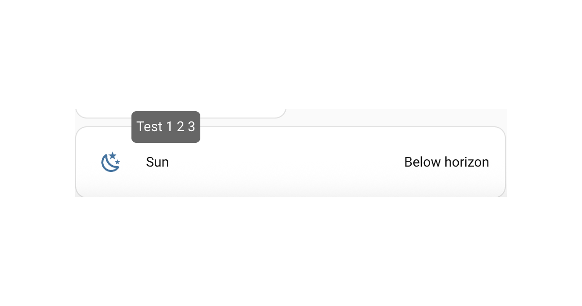
Tooltip for entities row
Next is to get a new tooltip. This can be done in CSS using the pseudo element ::before with initial opacity: 0, then showing on hover with a transition effect to make it appear to be rising from the middle. The below code shows a tooltip over the entities row. There is limited positional control so this will not do fancy positioning, flipping sides etc like ha-tooltip that custom:button-card and other Frontend elements use, nor any delay to showing the tooltip. However it works as is with UIX as its pure CSS.
type: entities
entities:
  - entity: sun.sun
    uix:
      style:
        hui-generic-entity-row $: |
          .info {
            pointer-events: none;
          }
          .row::before {
            content: "Test 1 2 3";
            display: inline-block;
            position: absolute;
            bottom: 50%;
            left: 10%;
            background: #666;
            color: #FFF;
            padding: 5px;
            border-radius: 5px;
            opacity:0;
            transition:.3s;
            overflow:hidden;
            max-width: 50%; /* avoids very long sentences */
            pointer-events: none; /* prevents tooltip from firing on pseudo hover */
          }
          .row:hover::before { opacity:1; bottom: 100%; }
Home Assistant output
Tooltip for a card
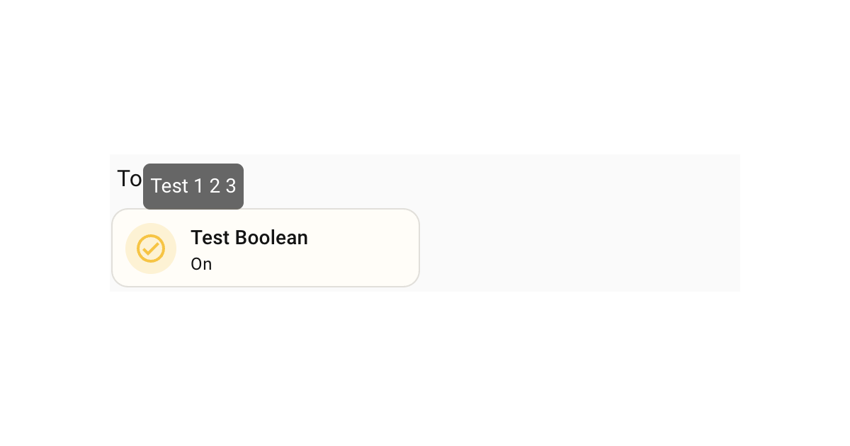
Following on from the example for the entities row, the same technique can be applied to any element, including ha-card. The following is an example of a tooltip for a tile card.
type: tile
entity: input_boolean.test_boolean
uix:
  style: |
    ha-card::before {
      content: "Test 1 2 3";
      display: inline-block;
      position: absolute;
      left: 10%;
      bottom: 50%;
      background: #666;
      color: #FFF;
      padding: 5px;
      border-radius: 5px;
      opacity:0;
      transition:0.3s;
      overflow:hidden;
      max-width: 50%; /* avoids very long sentences */
      pointer-events: none; /* prevents tooltip from firing on pseudo hover */
    }
    ha-card:hover::before { opacity:1; bottom: 100%; }
Home Assistant output