 UI eXtension Guides
Using UIX Forge tooltip and attribute sparks for tooltips
UIX Forge allows you to forge an element and apply various features with forge sparks. This guide uses the attribute spark and the tooltip spark to add rich, customizable tooltips to Home Assistant cards and elements.
Forge elements
All UIX Forge documentation will describe the card, row, badge, section, picture-element as element as indeed, a forged element is not restricted to being a card, but can be any type supported by UIX Forge mold type
The attribute spark lets you set or remove HTML attributes on elements inside a forged element’s shadow DOM. The tooltip spark adds a fully featured tooltip — with placement, delay, skidding, and CSS control — powered by UIX Forge.
Scenario 1: Adjust a title attribute with the attribute spark
A browser will display a native tooltip for any element that has a title attribute. The attribute spark can target an element by CSS selector and change its title attribute to any value you choose.
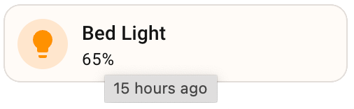
In the example below a tile card is forged and the attribute spark adds a title attribute whose value is a Jinja template. The template uses relative_time to show how long ago the entity last changed, producing a browser native tooltip that updates each time the card renders.
type: custom:uix-forge
forge:
  mold: card
  sparks:
    - type: attribute
      attribute: title
      action: add
      value: |
        {{ relative_time(states[config.element.entity].last_changed) }} ago
element:
  type: tile
  entity: light.bed_light
Home Assistant output — adjusted title tooltip
Scenario 2: Remove the title attribute and add the tooltip spark
Native browser tooltips have limited styling and behaviour options. A better approach is to use the attribute spark to remove the existing title attribute first, then add the tooltip spark to provide a fully featured replacement.
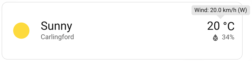
In this example a weather forecast card is forged. The attribute spark removes the native title from the location name element, and the tooltip spark adds a wind speed tooltip to the temperature/attribute area using Jinja templates to pull live state attributes.
type: custom:uix-forge
forge:
  mold: card
  sparks:
    - type: attribute
      for: "hui-weather-forecast-card $ div.name"
      attribute: title
      action: remove
    - type: tooltip
      for: "hui-weather-forecast-card $ div.temp-attribute"
      content: "Wind: {{ state_attr(config.element.entity, 'wind_speed') }} {{ state_attr(config.element.entity, 'wind_speed_unit') }} ({{ state_attr(config.element.entity, 'wind_bearing') }})"
element:
  show_current: true
  show_forecast: false
  type: weather-forecast
  entity: weather.carlingford
  forecast_type: daily
Home Assistant output — tooltip spark replacing native title
Removing the title attribute first
Always remove the native title attribute before adding the tooltip spark to avoid both appearing at the same time.
Scenario 3: Adjust tooltip show and hide delay times
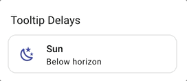
The tooltip spark provides show_delay and hide_delay options (in milliseconds) to control how quickly the tooltip appears and disappears. This is useful when tooltips should only show after intentional hover, or should linger longer after the cursor leaves.
type: custom:uix-forge
forge:
  mold: card
  sparks:
    - type: tooltip
      content: "I appear after a short pause and stay a little longer"
      show_delay: 600
      hide_delay: 300
element:
  type: tile
  entity: sun.sun
Home Assistant output — tooltip with custom show and hide delays
Delay tips
A show_delay of 400–600 ms is a good starting point for cards where you want to avoid the tooltip flashing during normal interaction. Use a small hide_delay (100–200 ms) to let the cursor move away without the tooltip feeling sticky.
Scenario 4: Rich CSS styles, placement, and skidding
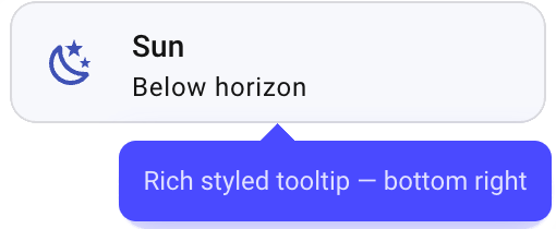
The tooltip spark also supports placement control and positional fine-tuning with placement, skidding, and distance options. These allow you to position the tooltip relative to the element and nudge it along or away from the element. Custom CSS can be applied with UIX Styling on the forge to create rich visual tooltip designs.
The supported placements are top, bottom, left, and right (with optional -start and -end variants such as top-start or bottom-end).
type: custom:uix-forge
forge:
  mold: card
  sparks:
    - type: tooltip
      content: "Rich styled tooltip — bottom right"
      placement: bottom-end
      skidding: 50
      distance: 8
      show_delay: 400
      hide_delay: 150
  uix:
    style: |
      :host {
        --uix-tooltip-background-color: #4a4aff;
        --uix-tooltip-content-color: #e0e0ff;
        --uix-tooltip-border-width: 1px;
        --uix-tooltip-border-style: solid;
        --uix-tooltip-border-color: #4a4aff;
        --uix-tooltip-border-radius: 8px;
        --uix-tooltip-padding: 0.85em;
        --uix-tooltip-box-shadow: 0 4px 16px rgba(74, 74, 255, 0.4);
      }
element:
  type: tile
  entity: sun.sun
Home Assistant output — richly styled tooltip with custom placement
Placement and skidding
skidding shifts the tooltip along the axis of the placement edge (e.g. left/right for top or bottom placements). distance controls how far away from the element the tooltip appears. Both accept positive and negative values.